UCHealth My Health Connection
MyHealthConnection is an application that allows patients to schedule appointments, message providers, update information, and pay bills within a convenient mobile app or desktop web portal experience. While it does offer a lot of options for patients and allows a more direct access to providers and options, changes can be made based on user feedback to make the experience easier, cleaner, and more cohesive, further fulfilling MyHealthConnection’s goals in bringing a simpler patient care experience. I designed this case study to explore ideas based on my work at UCHealth and imagine a new version of the app’s homescreen and scheduling workflow.
The Problems
Unfocused home screen that leads to confusion
Small buttons and text during appointment scheduling
Inability to sort appointments by location
Lack of organization in messaging system
Inconsistent spacing issues impacting readability
The Goal
Redesigning the mobile app’s homepage and scheduling workflow in order to provide clearer options and a cleaner look to make the scheduling experience easier for patients.
Research
When first beginning this case study, I looked at the app store reviews for the My Health Connection app for common problems and complaints, finding that many people were frustrated by the home screen’s lack of focus and the lack of clarity when scheduling. I also took my own experience as someone that takes calls for several UCHealth clinics as a reference for how the scheduling workflows occur and why patients turn to calling instead of using the app. I also evaluated apps like MyChart to gain a further understanding of applications that allow patients to manage their appointments and health records.
User Persona
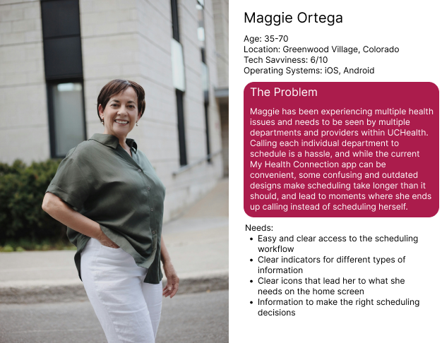
I created my user persona, Maggie, based on information gathered in my research findings. I wanted to include the diverse age range of patients often served at UCHealth, and the diversity of tech-savviness. By including this I am able to ensure that a wide range of patients are catered to, and accessibility needs can be considered.
Sketches
To get the ideas down, I created sketches using the ideas I had generated from research and the persona. I established basic layout ideas and provided general labels to ensure I could follow my own thinking.
Lo-Fi Prototype
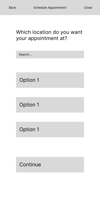
I then began work on the lo-fi prototype once I was satisfied with the layouts I had sketched, further refining the ideas to get a sense for placement, and to define the scheduling workflow further.
Hi-Fi Prototype
Homescreen
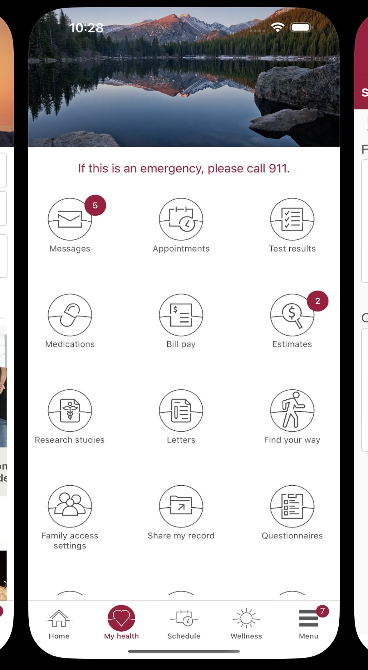
The homescreen prioritizes immediate access to the most commonly used functions by users, while still maintaining a clean and clear design, with a visually popping image and UCHealth’s colors as an accent. The menu bar of the app is edited to provide easier access to the main options without entirely changing the app’s flow to accommodate for developers and previous users.
Scheduling Workflow
The redesigned scheduling workflow asks the important decision tree questions that UCHealth employs in its scheduling process in a cleaner and easier to understand format. Locations can be searched to make it easy to select among the many varying UCHealth locations.
Additionally, different font sizes are prioritized for essential information that can be difficult for some patients to remember, such as times of appointments.
The cleaner look fits in better with UCHealth’s branding as a whole, and priortizes communicating essential info as effectively as possible.
Using the existing grouping functionality of the app’s appointment choices while changing the colors to be more cohesive with the app’s look creates harmony, and the confirmation screen serves the important purpose of displaying the time, which is often the most forgotten aspect of an appointment, in a bigger display to help remind users what time they are scheduling.
Conclusion
This project served to sharpen my design skills and ensured that I had practice redesigning an existing product for a large organization. I had to design something in line with UCHealth’s existing brand identity and development constraints, while ensuring that functionality is improved for users.


